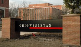
The new signboard at OWU makes me go eeeks!
So, I just read that Ohio Wesleyan University (OWU - pronounced as Oh-Woo), my alma mater, got a new welcome sign board. The Sandusky Street and Jaywalk intersection is one of the most prominent places on campus, where every visitor to Delaware at least passes by while driving on Sandusky Street and almost all students pass by this area everyday to classes and back. Having lived there for four years, I can still imagine the whole campus if I close my eyes. And I really enjoyed my time there and I really like the campus. I think its really pretty.
Recently OWU has gone through a lot of changes and I like most of them. Like the new steps to go down to Hayes from Welch residence halls (instead of the slippery, icy path). Like the new welcome center across from the Edwards Gym and its parking lot. But today I was just reading news from OWU and saw picture of a new welcome sign board it got and honestly, my first reaction was very disappointed. I think it looks ghastly. I know the old sign that was there was not great, but I think it at least looked better. No, make that - the old sign was awesome! They had gotten quite a few things right, the first time, which they just screwed up. This new sign has no majestic quality to it. Just see what I mean!
 This is a picture of the old sign, taken when I graduated in summer '05. It looks green. Its pretty. I dont like the shiny tiles, but it at least says Ohio Wesleyan University properly.
 This is a picture of the new sign, that was just recently constructed. Firstly, I think the pillars are too big and the words .OHIO.WESLEYAN. take a few minutes to digest (even for me, forget a visitor) and understand what really is written there. The sign should have been bigger, and there should have been more space between the words "Ohio" and "Wesleyan". (maybe I should become a branding consultant in life)!
Now, I agree that the new sign is placed much higher than before and is better visible to motorists who drive on Sandusky Street, rather than being half-hidden by grass. Also, the sign is much more consistent with the Ohio Wesleyan branding image and logo (which it probably adopted after the old sign was constructed), but still, it does nto have the same effect on people. I bet most people would just take it for granted. Everybody noticed the old one. Also, notice that the placement has changed... and it is really weird. It somehow is made to face its back to students who walk on Jaywalk everyday and the sign now faces the North Sandusky side more prominently. Whereas, the old sign, faced the Jaywalk as well as the students walking on the Jaywalk towards the academic side as well as both the North and the South Sandusky directions. It was perfect. The new one, its more business-like. As if the visitors and the perpectives are more important the students who actually go there. Plus the pillars look too big for the sign board. Its almost like having two large wrestlers carrying a little thing! Unh Unh! Not fun!
Oh well, I aint there anymore. So maybe it shouldn't matter. Or maybe it does! You know, only if such things matter to me, only if I feel strongly about my old school, my alma mater, will I still bewant to give money, and make an affordable education possible for other students like us. So maybe its a good thing that I still have such strong opinions about OWU!
Tagged: Ohio Wesleyan University, OWU, Delaware, OH
Recently OWU has gone through a lot of changes and I like most of them. Like the new steps to go down to Hayes from Welch residence halls (instead of the slippery, icy path). Like the new welcome center across from the Edwards Gym and its parking lot. But today I was just reading news from OWU and saw picture of a new welcome sign board it got and honestly, my first reaction was very disappointed. I think it looks ghastly. I know the old sign that was there was not great, but I think it at least looked better. No, make that - the old sign was awesome! They had gotten quite a few things right, the first time, which they just screwed up. This new sign has no majestic quality to it. Just see what I mean!
 This is a picture of the old sign, taken when I graduated in summer '05. It looks green. Its pretty. I dont like the shiny tiles, but it at least says Ohio Wesleyan University properly.
 This is a picture of the new sign, that was just recently constructed. Firstly, I think the pillars are too big and the words .OHIO.WESLEYAN. take a few minutes to digest (even for me, forget a visitor) and understand what really is written there. The sign should have been bigger, and there should have been more space between the words "Ohio" and "Wesleyan". (maybe I should become a branding consultant in life)!
Now, I agree that the new sign is placed much higher than before and is better visible to motorists who drive on Sandusky Street, rather than being half-hidden by grass. Also, the sign is much more consistent with the Ohio Wesleyan branding image and logo (which it probably adopted after the old sign was constructed), but still, it does nto have the same effect on people. I bet most people would just take it for granted. Everybody noticed the old one. Also, notice that the placement has changed... and it is really weird. It somehow is made to face its back to students who walk on Jaywalk everyday and the sign now faces the North Sandusky side more prominently. Whereas, the old sign, faced the Jaywalk as well as the students walking on the Jaywalk towards the academic side as well as both the North and the South Sandusky directions. It was perfect. The new one, its more business-like. As if the visitors and the perpectives are more important the students who actually go there. Plus the pillars look too big for the sign board. Its almost like having two large wrestlers carrying a little thing! Unh Unh! Not fun!
Oh well, I aint there anymore. So maybe it shouldn't matter. Or maybe it does! You know, only if such things matter to me, only if I feel strongly about my old school, my alma mater, will I still bewant to give money, and make an affordable education possible for other students like us. So maybe its a good thing that I still have such strong opinions about OWU!
Tagged: Ohio Wesleyan University, OWU, Delaware, OH
